


ICYMI: Last week, I shared 39 very good, mostly secondhand picture frames.

As always, you can support my work by upgrading your subscription here:
Today, I’ll be sharing the process and approach that went into creating the artwork for my most recent Home Food newsletter.
If you enjoy reading this post, let me know! I’d be happy to do more case studies in the future.
I’m less rigorous in my conceptual approach to my newsletters than I am when I’m professionally art directing. For one, I can’t dedicate the 5 to 10 hours I would expect an illustrator or photographer to spend, as I am my own newsletters’ writer, editor, producer, social editor, and audience development strategist. For two, there are reasons I am an art director, not an artist—my skills don’t match my eye/standards. I am stronger at vision and strategy than I am at production. But, nonetheless, I try to execute my ideas with care and intention.
The brief
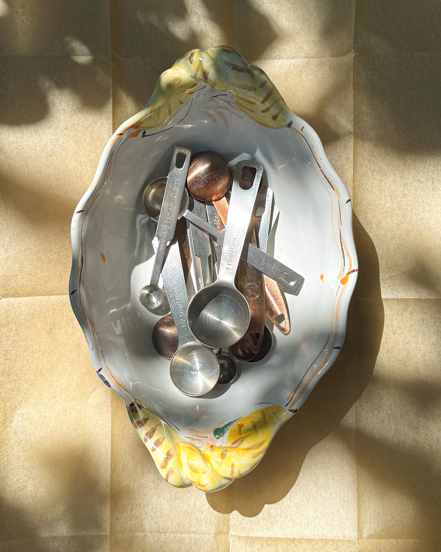
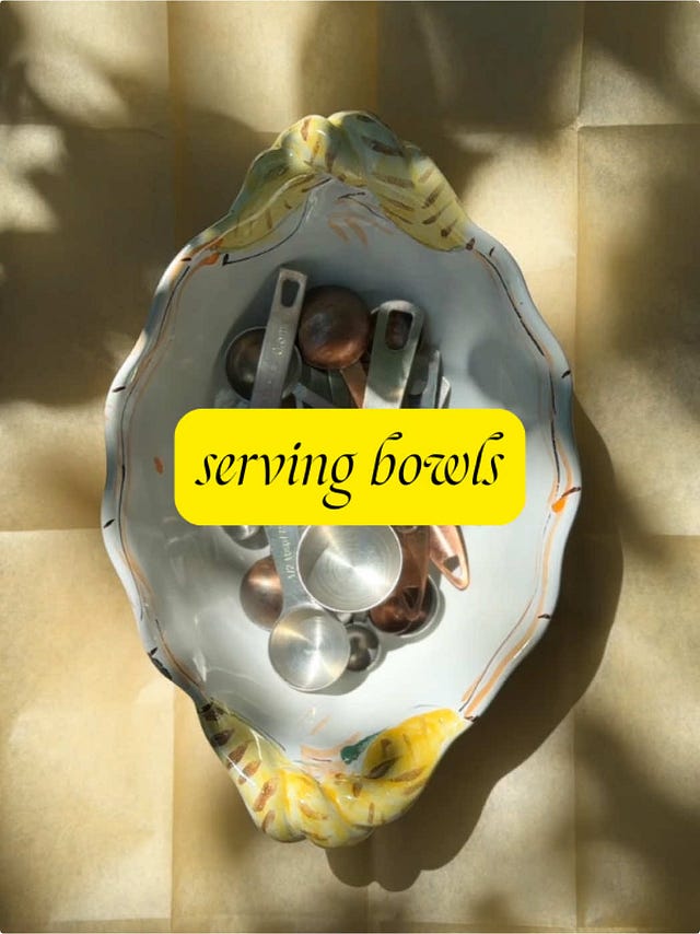
The article I wrote for Home Food was about what I wish I had known when I was a novice home cook. One of the tips (spoiler alert!) is to buy multiples of everyday tools. I have three sets of measuring spoons that I store in a serving dish on a shelf in my kitchen. I love the look of the serving bowl; the storage idea is somewhat unique, and it ties directly into my article. However, I didn’t want to photograph the bowl on the shelves where it’s stored, because, well, it’s boring.
The ideas
I don’t always start with reference images, or what some call “swipe” or a mood board, but for me, if I don’t have an immediate idea, it’s a good way to get excited about creating the artwork.
Most designers and art directors go to Instagram, Pinterest, or are.na for their mood boards. I’ve never been able to unlock Arena; its content is a little too “designer who works at the intersection of art and technology.” 'Tis not for me.
I’ll save things on Instagram, but for a quick inspo pull, I go to Pinterest. I feel like Pinterest’s algorithm has gotten a lot better in the last year? I’m less likely to see Mason jar DIYs and ugly clothes. (I don’t mind the amount of sponsored posts, I see, either. The curation is better than Instagram’s ads, and I like that they feed in Chairish, eBay, and Etsy.) The algorithm has its downsides, obviously—I’m experiencing a homogenous and commercial visual world by the nature of it being an algorithm and marketplace.
Anyway, I prefer to look at non-food photography for inspiration for Home Food’s art direction. Fashion is more editorial, more indulgent in beauty, and all-around much more interesting than food visual media.
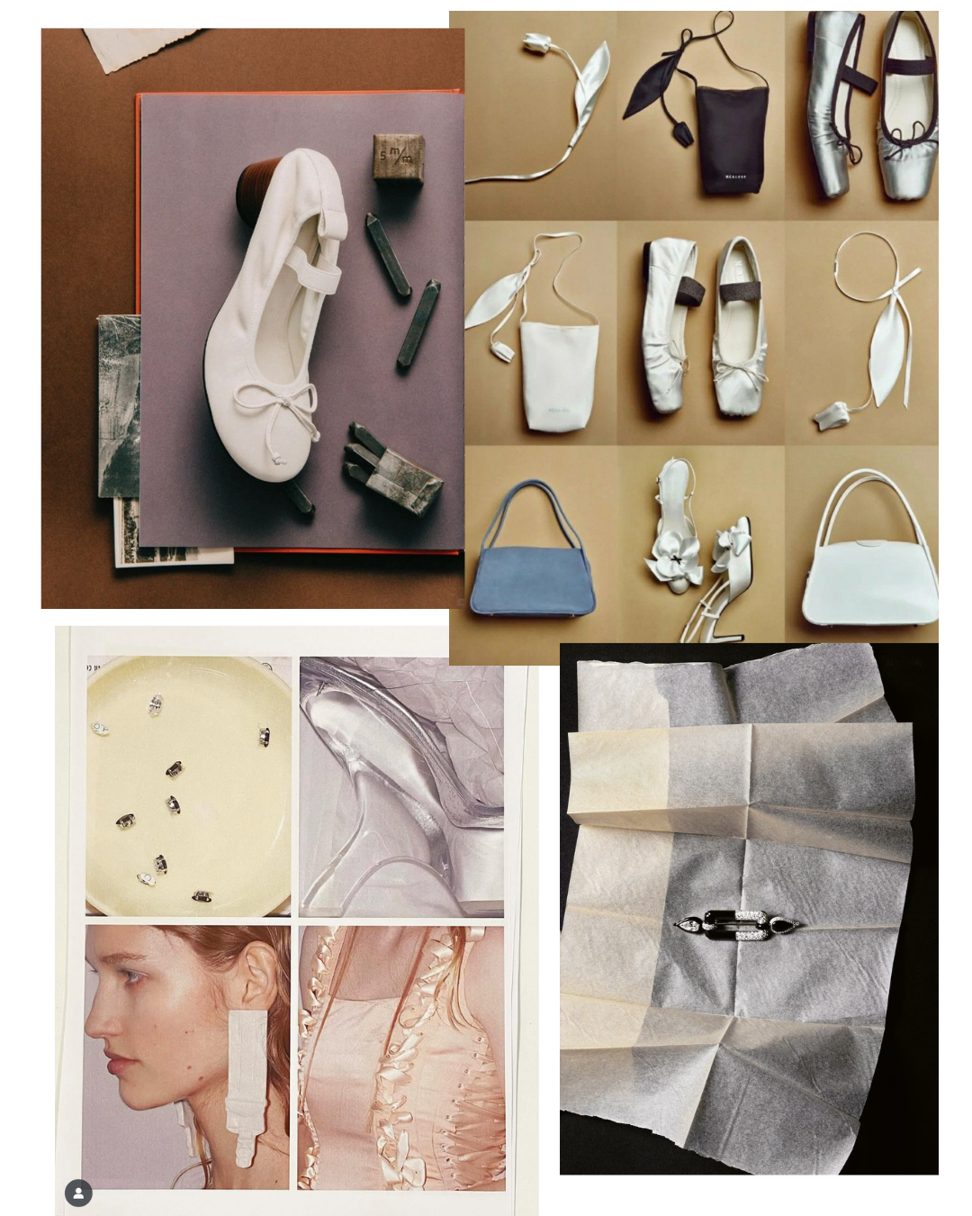
Credits: 1. Unknown — 2. Märchen SS23 — 3. Jean Paul Gaultier by Simone Rocha — 4. Mattieu Lavanchy / Cartier for AnotherMag
I gathered these four images (if you know the source of the first image, do let me know!).
These sorts of reference image collections are interesting because you’ll notice unconscious patterns you hadn’t realized you were making.
I liked the romantic feeling, soft colors, and diffused lighting. The top-down angle was likely how I would photograph the bowl of measuring spoons, so this gave me some ideas for composition. I liked the flash quality in the Simone Rocha image, too—it gave me a backup idea to photograph the spoons, along with other multiples in my kitchen (strainers, Instant Pot bowls), and lay it out in a grid.
The shoot
I loved the tissue paper in the Cartier image. It quickly occurred to me that I should use parchment paper, which conceptually makes more sense for a kitchen-related image. I’m glad I had this reference image, because I liked the way the paper was folded, and I ended up folding the parchment paper sheet in my photo. The folded paper added two things: structure (a grid!) and some texture, as the light played off the creases of the folded edges.
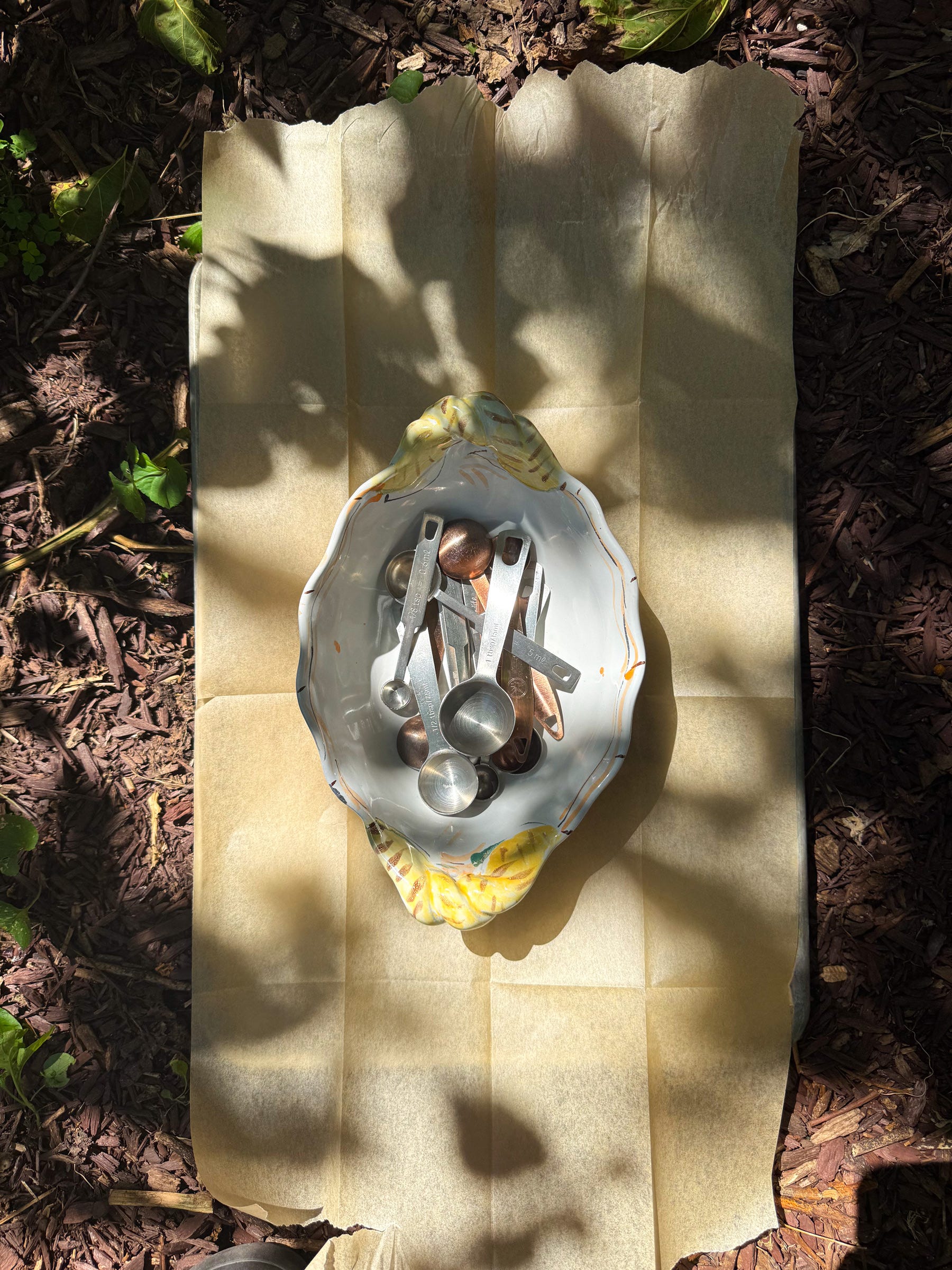
I usually photograph in natural window light, but it was a beautiful day, so I decided to use dappled shade in our backyard. The sunny, shadowed lighting was a departure from my mood board, but I lean more toward high contrast in my Home Food photography, anyway, and a mood board is not a prescription.
I brought a large sheet pan from the kitchen to use as a surface.
I started by shooting with my real camera, the Fujifilm X100V ($2,048). I love this camera! I bought it a few years ago, and if you’re looking for a compact, film-like digital camera, I can’t recommend it enough. The photography for Home Food, and much of Saltine, is from this camera.
With the Fujifilm though, I realized this was not the right camera for the job. The shadows were too deep. I’m not technically skilled enough as a photographer to know how to reduce the shadows in-camera. If I had a reflector (which I don’t), I might have been able to brighten up the shadows.
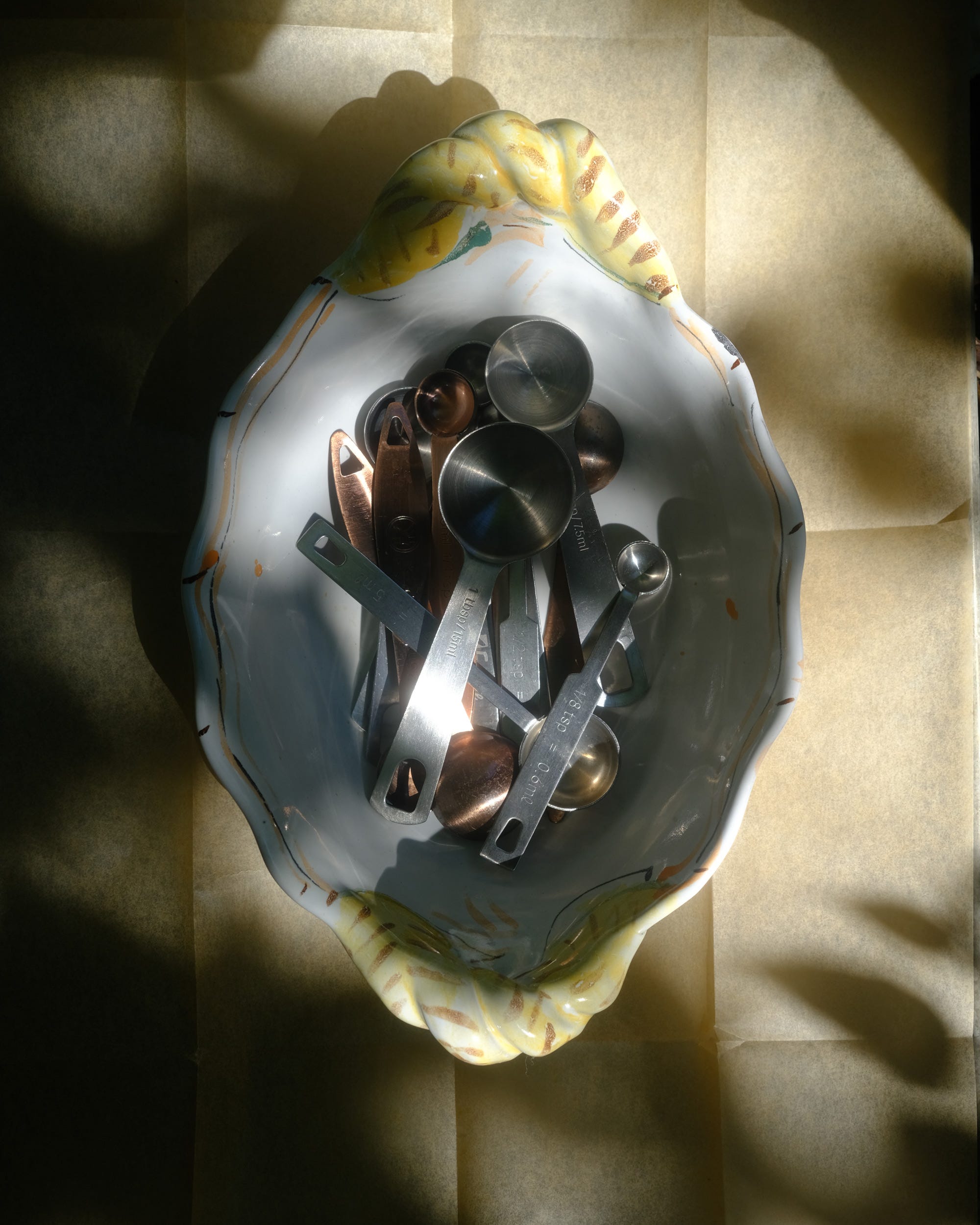
I decided to switch to my iPhone.
Since I was working with the direct sun, I had to shoot further out because the phone and my hands were casting shadows into my composition.
There was some wind that day, and I ended up taking a video of the leaves’ shadows. I turned this into a TikTok:
 Tiktok failed to load.
Enable 3rd party cookies or use another browser
The edit
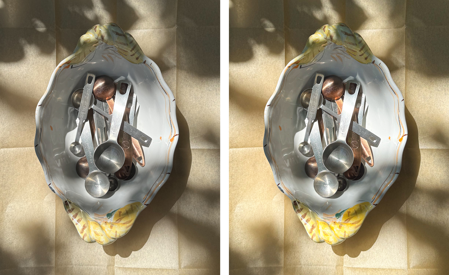
I edit all my photography in the iOS Lightroom app ($40/year). I’m really over Adobe products right now, but this app is a rare Adobe slay.
Here, I used the “SM01” filter, increased both the whites and blacks, and added sharpness and a slight amount of grain. I wanted there to be a warmer, brighter glow, and these adjustments achieved that.
Before and after:
I photographed this in portrait/vertical orientation, which I do 90% of the time now. This is a platform and device-informed choice. Tall images perform better on Instagram (as a viewer can see more of the image on a vertical phone screen), and the same thinking applies to newsletters, where most readers read newsletters on their phones. I crop my images at a 4x5 aspect ratio.
And, that’s it! What do you think of my approach?
This newsletter contains affiliate links—meaning I may earn a small commission from items you buy, at no cost to you.
By the way, I am currently available for part-time, freelance creative support. If you’re a business looking to define its visual editorial strategy or to level up your social creative direction, I’m your girl. See my services menu here! Case study portfolio available upon request.